Shape, frame and type
Shape
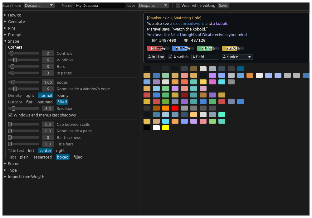
- Corners, each from 0, square, to 32:
- Controls: buttons, fields, checkboxes, dropdowns and tabs.
- Windows: windows, menus and popups.
- Bars: the vitals and every other bar.
- In panes: indicators, the compass’s cells, a find’s hits, and the outline of the window in use.
- Edges: an edge’s width on controls and windows.
- Density: how close controls sit and how much room is inside them: tight, normal or roomy.
- Buttons: how a button looks at rest: flat, its words alone until you point at it; outlined; or filled. Every style fills under the pointer.
- Scrollbar: its width.
- Windows and menus cast shadows.
- Gap between cells: between the cells of a custom window.
- Room inside a pane: round each widget, inside its pane.
- Bar thickness: the most a bar is thick, centred in its pane; 0 fills the pane.
- Title bars: a window’s title bar’s height, and a cell’s tabs’; 0 is the usual.
- Title text: where a window’s title sits: left, center or right.
- Tabs: how a cell’s tabs are drawn: plain, their words alone;
separated, a line between each two; boxed, an edge round each, the
shown one filled; or filled, each on the tab ground. A theme’s tabs
are boxed unless it says otherwise. A cell can choose its own, under
Tab look on any of its tabs’ pages in Settings. The grounds are the
tabandtab_shownpins.
Frame
Frame draws a picture frame round every window and card: a frame kit from an installed pack, named by its pack and style. Frame kits come from Packs in the Editors window, under Frame kits. The base’s keeps the frame of the theme it is laid over; none draws none.
Thickness is how far in from a window’s edge its title and content keep; the whole frame is drawn at that scale. The frame is each window’s border, in place of its own edge, flush with it. Some kits’ decoration reaches further in, over the content – honey drips, thorns – but only in a window’s top half: below its middle nothing is drawn deeper than the thickness.
Type
- UI font and UI size: everything but the game’s words.
- Story font and Story size: the story, its streams and the room.
- Story line spacing: room added between two lines of the story and its streams.
- Fixed-width font and Fixed-width size: the tables the game lines up, Hydra’s tables, and the log window.
- Fallbacks: fonts tried in turn for a character a font lacks, a symbol or an accented letter. Add a fallback adds one; Take out removes it.
- Give a kind its own…: a kind of widget with a font or size of its own, Thoughts smaller or the Room in another font. One widget can have its own too, on its page in Settings.
A font is one in the fonts folder of Hydra’s data folder, a .ttf or
.otf put there, or any font installed on the computer: open the list
and type part of its name. A font takes a moment to load the first time;
the window redraws once it has.